01Free · AppSource
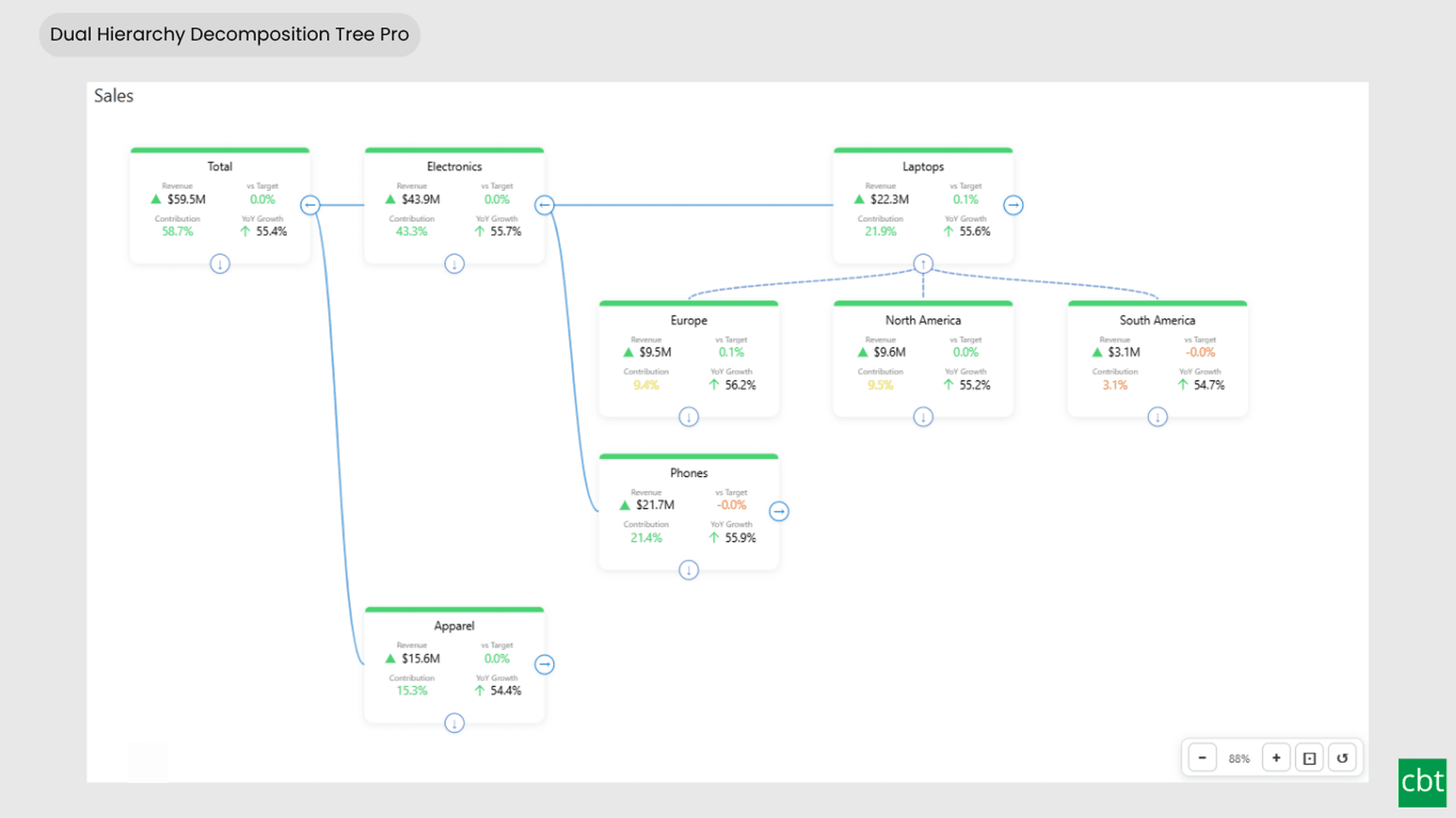
Dual Hierarchy Decomposition Tree Pro
DAX-driven KPI tree with dual-axis drill-down, per-KPI colors, icons, and Microsoft-certified Pro features.
- ✓Bi-directional tree layout with horizontal and vertical hierarchy axes
- ✓Up to 4 KPI measures displayed per card
- ✓DAX-driven status bar colors, dynamic font colors & dynamic icons
02Free · AppSource
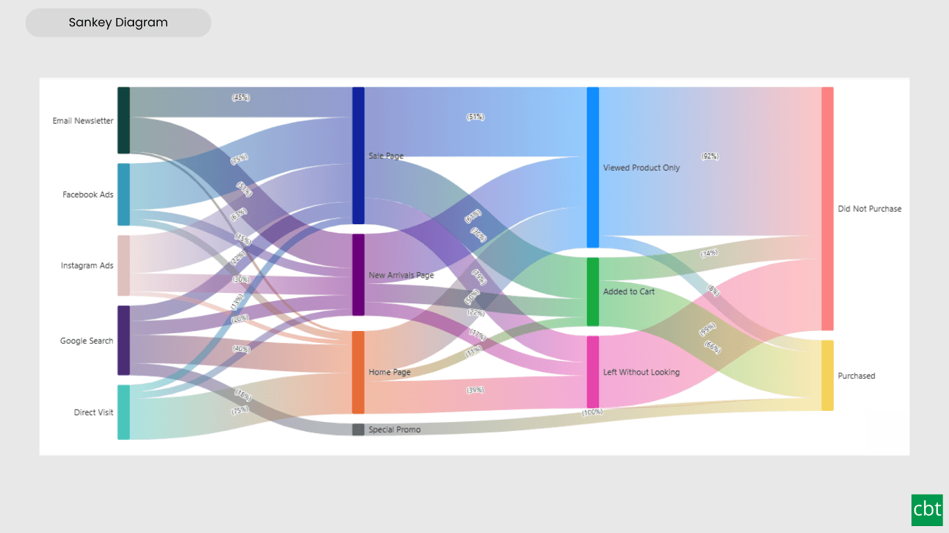
Sankey Diagram
Interactive Power BI Sankey diagram for visualizing multi-stage flow data, with automatic node-to-ribbon color gradients and rule-based conditional formatting.
- ✓Interactive Sankey diagram for multi-stage flow data
- ✓Node-driven gradient coloring, with manual per-flow color override
- ✓Conditional formatting for automatic, rule-based flow coloring

03Free · AppSource
Dual Axis Bar & Column Chart
Plot two measures on independent scales without dropping in a separate combo chart.
- ✓Independent left & right axes
- ✓Small multiples + conditional colours
- ✓Native cross-filtering & drill-down

04Free · AppSource
Dual Hierarchy Decomposition Tree
Up to four KPIs per card across two hierarchy axes, with DAX-driven status colours.
- ✓Two-axis hierarchy, multi-level drill
- ✓Up to 4 measures per card
- ✓DAX-driven traffic-light status

05Free · AppSource
Multi KPI Decomposition Tree
Decompose up to five measures per node, with stacked bars on every branch.
- ✓Up to 5 measures per node
- ✓Stacked bars at each level
- ✓Expand / collapse hierarchies in place

06Free · AppSource
Arabic Matrix Table
Right-to-left matrix with Arabic labels, hierarchical rows, subtotals and grand totals.
- ✓Native RTL layout & numerals
- ✓Multi-level row & column hierarchies
- ✓Subtotals + grand totals

07Free · AppSource
Arabic Stacked Bar Chart
RTL-native stacked bars with Arabic number units, small multiples and cross-filtering.
- ✓RTL axis & data labels
- ✓Arabic number units
- ✓Small multiples + cross-filtering

08Free · AppSource
Arabic Stacked Column Chart
RTL-native stacked columns matched to the Arabic Bar visual for consistent dashboards.
- ✓RTL axis & data labels
- ✓Visual parity with the Bar variant
- ✓Small multiples + cross-filtering

09Free · AppSource
Arabic Waterfall Chart
Sequential value walk for Arabic dashboards — variance, build-up and bridge analyses.
- ✓RTL value walk
- ✓Custom positive / negative / total colours
- ✓Tooltip & cross-filter support
10Free · AppSource
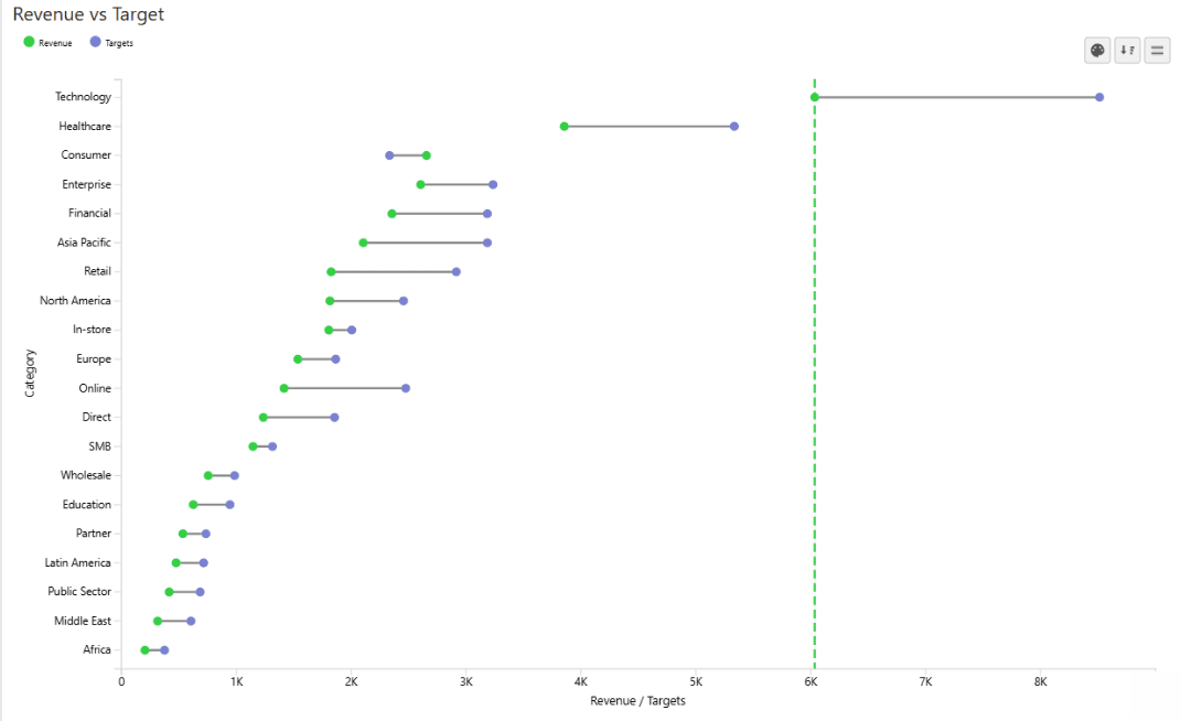
Dumbbell Chart
Two markers per category on a shared scale, connected by a line that makes the gap immediately visible.
- ✓Two markers + connecting gap line per category
- ✓Currency / % aware labels with directional triangles
- ✓Conditional colours, reference bands & small multiples
11Free · AppSource
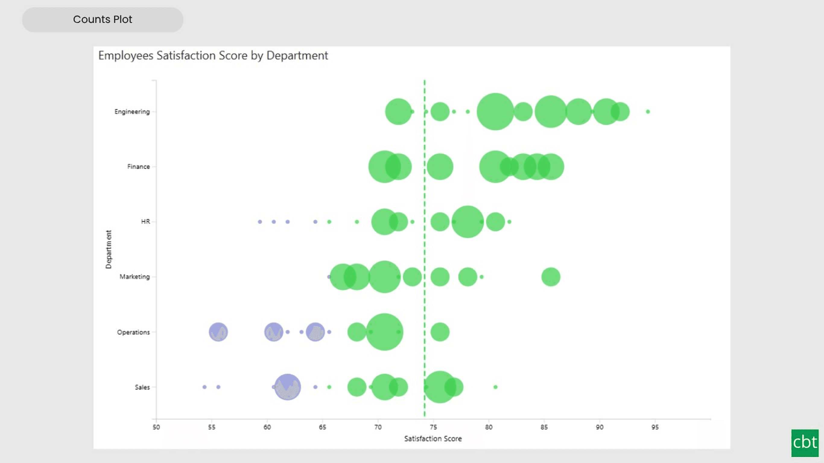
Counts Plot
Visualise data distribution with dots scaled by frequency across category lanes.
- ✓Dots scaled to frequency with auto or manual binning
- ✓Category swim lanes for side-by-side comparison
- ✓Conditional colours, reference bands & small multiples
12Free · AppSource
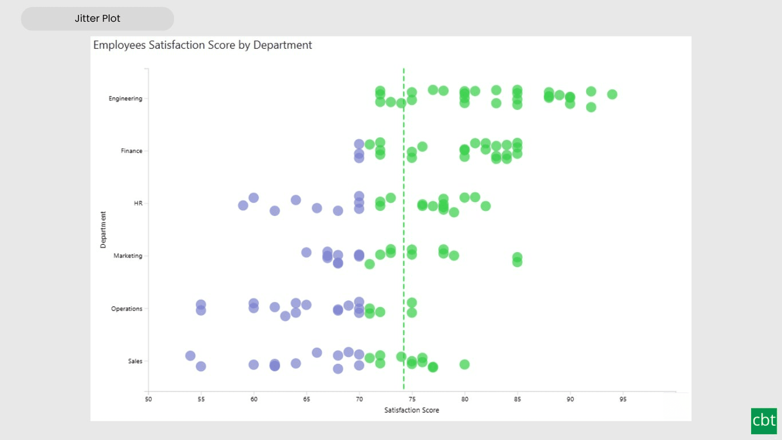
Jitter Plot
Show every data point with jitter or beeswarm layout for distribution analysis.
- ✓Every observation as an individual dot per lane
- ✓Jitter and beeswarm layout modes
- ✓Conditional colours, reference bands & small multiples

13Free · AppSource
Auto Single Select Slicer
Smart Power BI slicer with automatic first-value selection — reports never load with an empty filter.
- ✓Auto-selects the first value on load
- ✓Compact dropdown, single-select only
- ✓Selection persists through filter updates

14Free · AppSource
AutoSelect Slicer
Smart Power BI slicer with automatic selection across single-select and multi-select scenarios.
- ✓Auto-select first value or all values on load
- ✓Dropdown, List, and Tile layouts
- ✓Single and multi-select with Select All
