
What it does.
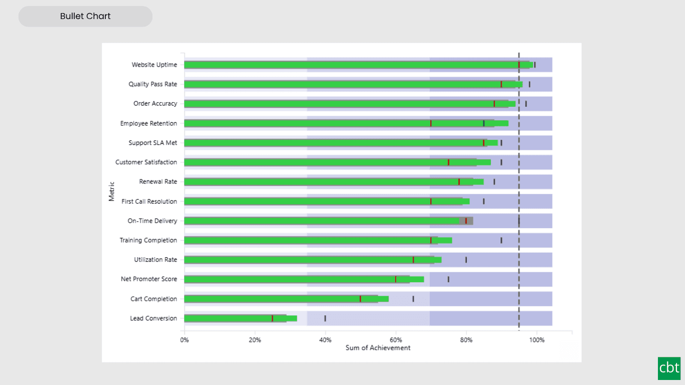
The Bullet Chart by CBT is a modern, feature-complete implementation of Stephen Few's bullet graph, the compact alternative to gauges for performance dashboards. It shows a performance measure against one or more targets, set within qualitative performance bands, so you can see at a glance whether each KPI is on track.
Unlike a gauge, the bullet chart packs a full performance story into a small, linear footprint, making it ideal for dashboards where you need to compare many KPIs side by side.
Multiple targets. Bind as many target measures as you need (target, forecast, stretch goal). Each renders as its own marker with independent shape, color, and size, formatted by its real measure name.
Comparative series. Show a second measure (such as prior year) as a context bar behind the main measure, for instant period-over-period comparison.
Qualitative bands. Add unlimited performance bands (poor, satisfactory, good) against the shared value axis, with custom colors, opacity, and labels. A single-hue intensity mode generates colorblind-friendly light-to-dark shades.
Variance analysis. Show variance against any target or the comparative series, as absolute value, percentage, or both, with up and down indicators. Choose which baseline to compare against.
Flexible orientation. Switch between horizontal and vertical layouts with a single setting.
Small multiples. Split the chart into a trellis grid to compare a KPI across regions, periods, or categories, the stacked-comparison use case bullet charts were designed for.
Rich formatting. Full control over the measure bar, comparative bar, target markers, bands, data labels, axes, and legend. Currency and percentage formats are detected automatically from your data model.
Conditional colors. Color the measure bar by rules, field values, or gradient using the built-in conditional formatting engine.
Full interactivity. Cross-filtering, drill-down, drill-through, report page tooltips, and bookmark support all work out of the box.
Accessibility. Keyboard navigation, screen-reader labels, high-contrast mode support, and visible focus indication.
Free. Every feature is free. No premium tier, no locked features.
Use Cases • Revenue vs target, forecast, and stretch goal • Actual vs budget with prior-year context • KPI scorecards across regions or products • SLA attainment and quality metrics • Any performance-against-target tracking
What ships today, what’s next.
Available now14 capabilities
- Multiple target markers, each formatted by its real measure name
- Comparative series bar for period-over-period context
- Unlimited qualitative bands with single-hue colorblind-friendly mode
- Variance analysis (absolute, percent, or both) against any target or comparative
- Horizontal and vertical orientation
- Small multiples trellis grid
- Conditional color formatting (rules, field values, gradient)
- Currency and percentage format-aware axes
- Cross-filtering, drill-down, drill-through, report page tooltips
- Bookmark support
- Keyboard navigation and screen-reader accessibility
- High-contrast mode support
- Landing page quick-start guidance
- Completely free, no premium tier
On the roadmap2 planned
- Data-bound dynamic bands
- Saved formatting templates
Other custom visuals.
19 more visuals in the catalogue. All free to download.
Histogram
Interactive histogram for visualizing the distribution of a continuous measure, with flexible binning, weighted bin heights, and built in statistical overlays.
Learn more →Advanced Gantt Chart
Interactive Gantt chart for visualizing hierarchical project schedules, with automatic parent task rollups, dual baseline and actual timeline bars, and rule-based conditional formatting.
Learn more →Lollipop Chart
Compare one value across many categories with clean stems and markers on a shared scale, and track each category against its target.
Learn more →Cluster Analysis Chart
A scatter plot that groups points into clusters by similarity using K-Means, DBSCAN, or Hierarchical clustering. Shows centroids, hulls, ellipses, outliers, and dendrograms, with no R or Python.
Learn more →Sparkline KPI Card
KPI Card with Sparkline for Power BI that displays KPI values, previous period comparisons, targets, variance, trend indicators, and interactive sparklines in a compact, business-ready visual.
Learn more →Advanced Sankey Diagram
Interactive Power BI Sankey diagram for visualizing multi-stage flow data, with automatic node-to-ribbon color gradients and rule-based conditional formatting.
Learn more →Dual Hierarchy Decomposition Tree Pro
DAX-driven KPI tree with dual-axis drill-down, per-KPI colors, icons, and Microsoft-certified Pro features.
Learn more →Dual Axis Bar & Column Chart
Plot two measures on independent scales without dropping in a separate combo chart.
Learn more →Dual Hierarchy Decomposition Tree
Up to four KPIs per card across two hierarchy axes, with DAX-driven status colours.
Learn more →Multi KPI Decomposition Tree
Decompose up to five measures per node, with stacked bars on every branch.
Learn more →Arabic Matrix Table
Right-to-left matrix with Arabic labels, hierarchical rows, subtotals and grand totals.
Learn more →Arabic Stacked Bar Chart
RTL-native stacked bars with Arabic number units, small multiples and cross-filtering.
Learn more →Arabic Stacked Column Chart
RTL-native stacked columns matched to the Arabic Bar visual for consistent dashboards.
Learn more →Arabic Waterfall Chart
Sequential value walk for Arabic dashboards — variance, build-up and bridge analyses.
Learn more →Dumbbell Chart
Two markers per category on a shared scale, connected by a line that makes the gap immediately visible.
Learn more →Counts Plot
Visualise data distribution with dots scaled by frequency across category lanes.
Learn more →Jitter Plot
Show every data point with jitter or beeswarm layout for distribution analysis.
Learn more →Auto Single Select Slicer
Smart Power BI slicer with automatic first-value selection — reports never load with an empty filter.
Learn more →AutoSelect Slicer
Smart Power BI slicer with automatic selection across single-select and multi-select scenarios.
Learn more →Need a custom Power BI visual built for your reporting?
Thirty minutes with a senior BI consultant. We’ll walk your report, scope the visual, and tell you whether a build makes sense.