
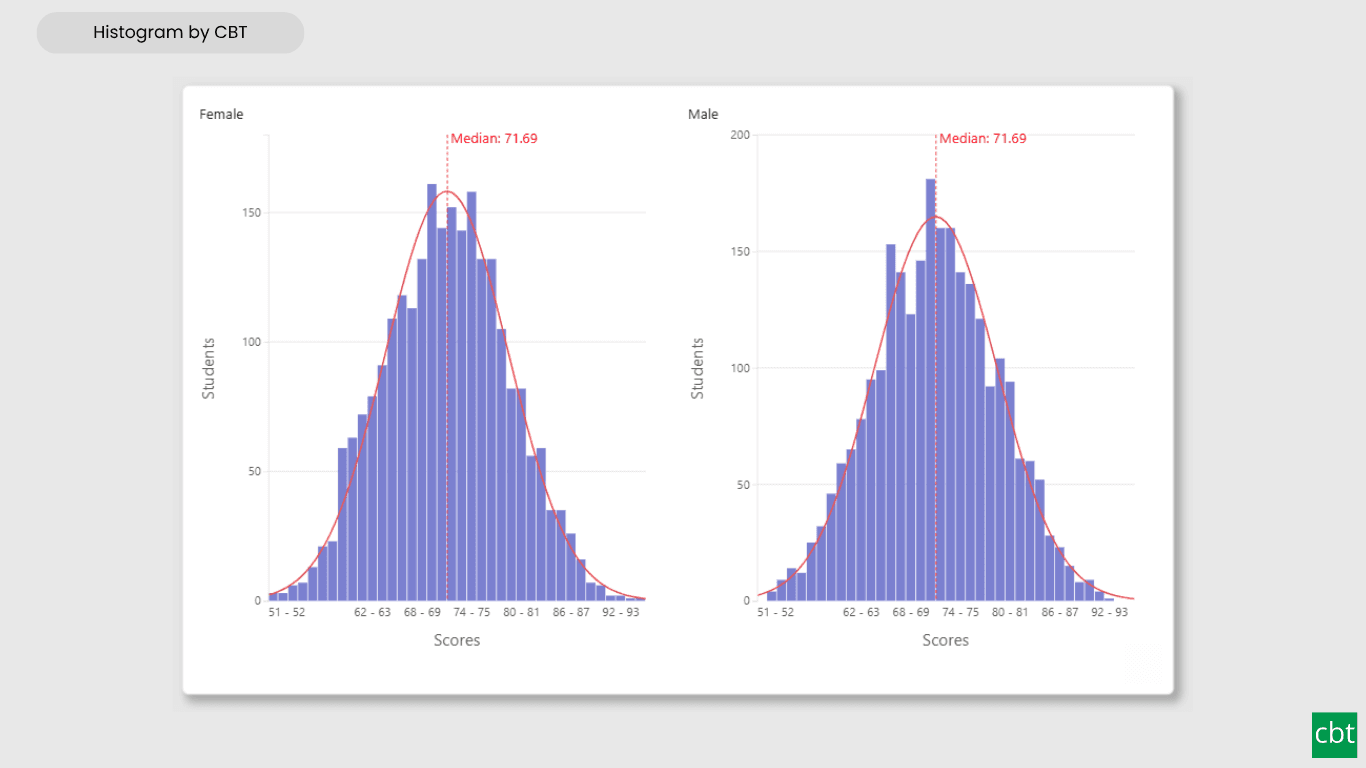
What it does.
Report authors frequently need to see how a measure such as spend, salary, or wait time is actually distributed across its full range, not just its average, without losing sight of outliers, skew, or multiple peaks in the data. Power BI has no native histogram visual. Microsoft removed the one it once shipped from AppSource with no replacement, leaving users to either build a workaround with DAX and a native bar chart, or fall back to a smaller field of third party visuals of inconsistent depth.
Histogram by CBT solves this by binning a single continuous measure automatically, or by a fixed count, fixed width, quantile, or custom edges typed in directly, and rendering the result as a fully interactive bar chart. Bin height can reflect a simple row count, or a weighted sum, average, minimum, or maximum of any bound field, so a bar can represent far more than a count of rows.
Mean, median, mode, percentile, and custom reference lines can be layered directly onto the chart, with per-series or combined normalization for multi-series comparisons, alongside a standard deviation band and a fitted normal curve for comparing real data against an idealized distribution. An outlier bin isolates extreme values without crushing the core distribution, and an optional logarithmic bin axis keeps wide ranging data readable.
Multiple categories can be compared as stacked or overlaid bars, a frequency polygon, or a full grid of small multiple panels with independently configurable axes. The chart can be plotted as vertical columns or horizontal bars, and every value can be viewed as a raw count, a percent, a density, or a running cumulative total.
The visual supports Power BI's native interactions, cross filtering, right click context menus, rich tooltips, and keyboard navigation, plus high contrast theming, independent display unit and decimal precision control on both the bin axis and the value axis, and a configurable formatting pane for every element on the chart. It integrates naturally into any report without needing an external statistics tool or a workaround built from DAX.
What ships today, what’s next.
Available now17 capabilities
- Interactive histogram for visualizing measure distributions
- Automatic, fixed count, fixed width, quantile, or custom binning
- Weighted bin height, using count, sum, average, minimum, or maximum
- Mean, median, mode, percentile, and custom reference lines
- Standard deviation band and normal curve overlay
- Outlier bin with automatic detection of extreme values
- Logarithmic bin axis for wide ranging data
- Stacked, overlaid, or frequency polygon multi-series comparison
- Small multiples with independently configurable axes per panel
- Vertical or horizontal orientation
- Count, percent, density, and cumulative value modes
- Display unit and decimal precision control for both axes
- Cross-filtering and native Power BI interaction support
- Right-click context menu support
- Rich tooltips with bin range and statistical detail
- Keyboard accessibility and high-contrast theme support
- User-friendly formatting pane configuration
On the roadmap2 planned
- Pattern styles for bars
- Second Value and Weight axis
Other custom visuals.
19 more visuals in the catalogue. All free to download.
Advanced Gantt Chart
Interactive Gantt chart for visualizing hierarchical project schedules, with automatic parent task rollups, dual baseline and actual timeline bars, and rule-based conditional formatting.
Learn more →Bullet Chart
Compare performance against multiple targets with qualitative bands, variance, and small multiples.
Learn more →Lollipop Chart
Compare one value across many categories with clean stems and markers on a shared scale, and track each category against its target.
Learn more →Cluster Analysis Chart
A scatter plot that groups points into clusters by similarity using K-Means, DBSCAN, or Hierarchical clustering. Shows centroids, hulls, ellipses, outliers, and dendrograms, with no R or Python.
Learn more →Sparkline KPI Card
KPI Card with Sparkline for Power BI that displays KPI values, previous period comparisons, targets, variance, trend indicators, and interactive sparklines in a compact, business-ready visual.
Learn more →Advanced Sankey Diagram
Interactive Power BI Sankey diagram for visualizing multi-stage flow data, with automatic node-to-ribbon color gradients and rule-based conditional formatting.
Learn more →Dual Hierarchy Decomposition Tree Pro
DAX-driven KPI tree with dual-axis drill-down, per-KPI colors, icons, and Microsoft-certified Pro features.
Learn more →Dual Axis Bar & Column Chart
Plot two measures on independent scales without dropping in a separate combo chart.
Learn more →Dual Hierarchy Decomposition Tree
Up to four KPIs per card across two hierarchy axes, with DAX-driven status colours.
Learn more →Multi KPI Decomposition Tree
Decompose up to five measures per node, with stacked bars on every branch.
Learn more →Arabic Matrix Table
Right-to-left matrix with Arabic labels, hierarchical rows, subtotals and grand totals.
Learn more →Arabic Stacked Bar Chart
RTL-native stacked bars with Arabic number units, small multiples and cross-filtering.
Learn more →Arabic Stacked Column Chart
RTL-native stacked columns matched to the Arabic Bar visual for consistent dashboards.
Learn more →Arabic Waterfall Chart
Sequential value walk for Arabic dashboards — variance, build-up and bridge analyses.
Learn more →Dumbbell Chart
Two markers per category on a shared scale, connected by a line that makes the gap immediately visible.
Learn more →Counts Plot
Visualise data distribution with dots scaled by frequency across category lanes.
Learn more →Jitter Plot
Show every data point with jitter or beeswarm layout for distribution analysis.
Learn more →Auto Single Select Slicer
Smart Power BI slicer with automatic first-value selection — reports never load with an empty filter.
Learn more →AutoSelect Slicer
Smart Power BI slicer with automatic selection across single-select and multi-select scenarios.
Learn more →Need a custom Power BI visual built for your reporting?
Thirty minutes with a senior BI consultant. We’ll walk your report, scope the visual, and tell you whether a build makes sense.